
Introduction
In modern organizations, conversations about data and AI almost always lead to the same fundamental question: Do we truly understand what data we have, and are we using it effectively?
This question is more difficult than it sounds. Data grows faster than governance, and AI initiatives often move quicker than visibility frameworks can keep up.
Interestingly, one of the most effective ways to structure this problem comes not from computer science, but from psychology. By adapting Johari’s Window, a classic awareness model, we can create a practical and intuitive data visibility model that helps organizations clearly see which data is usable, which is overlooked, and which may even pose hidden risks.
What Is Johari’s Window
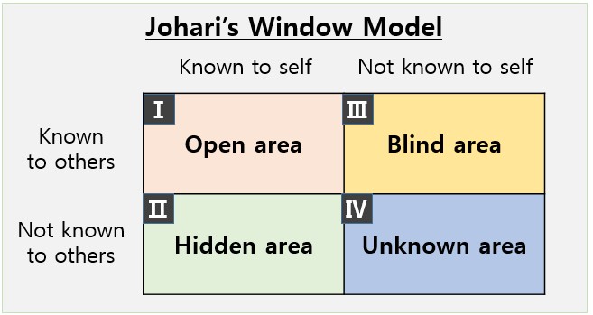
Johari’s Window was introduced in 1955 by psychologists Joseph Luft and Harrington Ingham as a way to describe how people perceive themselves and how they are perceived by others. The framework divides awareness into four quadrants using a simple two-by-two matrix.
What makes this model powerful is not its psychological origin, but its structure. By organizing complexity into “known” and “unknown” dimensions, Johari’s Window provides clarity where ambiguity usually dominates. This same logic applies directly to enterprise data environments, where the real challenge is not a lack of data, but a lack of awareness about it.
In data management, visibility problems often stem from uncertainty around ownership, usage, and relevance. Johari’s Window gives us a language to describe those uncertainties in a way that is easy to communicate across technical and business teams.
Reframing the Axes for Data Management and AI
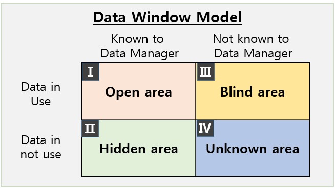
To apply Johari’s Window to data visibility, the original psychological axes need to be reinterpreted in a data context.
The horizontal axis represents the data team’s awareness. On one side lies data that is clearly identified, documented, and acknowledged by data managers. On the other side lies data that exists somewhere in the organization but remains unknown to central governance teams.
The vertical axis represents actual usability. Some data is actively used in analytics, reporting, or AI models, while other data remains unused due to quality issues, lack of access, or unclear business value.
By redefining the axes in this way, the Johari framework transforms into a data visibility map that shows not only what data exists, but how safely and effectively it is being used.
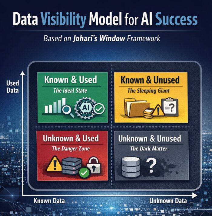
Once the axes are defined, the data landscape naturally falls into four distinct areas. Each quadrant represents a different relationship between awareness and usage, and each carries its own opportunities and risks.
1) Known & Used Data — The Ideal State
This quadrant represents the most mature and stable data assets in an organization. These datasets are well documented, trusted, and actively used for dashboards, analytics, and AI models. Data lineage is clear, quality is monitored, and usage aligns with business goals.
Organizations operating strongly in this quadrant tend to achieve better AI outcomes because their models are trained on data that is both reliable and explainable. Research consistently shows that AI performance improves when training data quality and governance are high, reinforcing the importance of sustained visibility rather than one-time documentation.
The key challenge here is not discovery, but maintenance. As systems evolve and new pipelines are added, continuous visibility is required to ensure this data remains accurate, compliant, and relevant.
2) Known but Unused Data — The Hidden Opportunity
This quadrant contains data that is visible to the organization but not actively used. In many enterprises, this is the largest category. Data exists in warehouses or storage systems, yet never reaches analysts or AI pipelines.
This typically happens for a small number of recurring reasons:
- Data quality is too inconsistent to trust
- Formats or schemas are not standardized
- Ownership and accountability are unclear
Although this data is not immediately harmful, it represents lost potential. Studies estimate that poor data quality costs organizations millions of dollars annually through inefficiencies and missed insights. Addressing this quadrant often delivers quick wins by unlocking value from assets the organization already owns.
Rather than asking “Why isn’t this data used?”, the better question is “What would need to change for this data to become usable?”
3) Unknown but Used Data — The Highest Risk Zone
This quadrant is where the most serious problems occur. Here, data is actively being used in applications, analytics, or AI models without central awareness or governance. This often happens when individual teams build solutions independently or bypass enterprise data platforms.
The risks are substantial. Data used without visibility may violate security or privacy requirements, introduce bias into AI models, or produce results that cannot be explained or audited. Industry research shows that a significant percentage of AI initiatives fail to scale because organizations cannot trust or validate the data feeding their models.
When this quadrant exists, it is a strong signal that governance frameworks and discovery mechanisms are insufficient. Solving the problem requires more than visualization—it requires redefining ownership, accountability, and enforcement across the data lifecycle.
4) Unknown & Unused Data — Dormant but Not Harmless
At first glance, data that is neither known nor used may seem irrelevant. However, in dynamic environments, dormant data rarely stays dormant forever. New analytics tools, AI projects, or integrations can suddenly pull this data into active use.
This makes the quadrant less about immediate value and more about preparedness. Organizations that regularly scan for unknown data sources and define clear onboarding rules are better equipped to prevent future visibility gaps.
Ignoring this area entirely increases the likelihood that data will move directly into the “unknown but used” quadrant without governance controls.
Why Data Visibility Is the Foundation of AI Success
The most important insight from this model is simple but often overlooked: data management and data usage cannot be separated. AI performance issues are rarely caused by algorithms alone. More often, they stem from poor visibility into data sources, quality, and usage context.
Organizations that succeed with AI can clearly answer three foundational questions:
- Do we know what data exists in our environment?
- Is this data truly usable for analytics and AI?
- Do we understand who is using the data and for what purpose?
When these questions have clear answers, data governance, analytics, and AI strategy naturally align.
Practical Steps to Improve Data Visibility
Improving data visibility does not require rebuilding everything from scratch. It requires consistent focus on a few core practices:
- Establishing a centralized data catalog that reflects real usage
- Tracking data lineage and metadata across systems
- Embedding governance requirements into AI and analytics workflows
- Using automated discovery tools to reduce blind spots
These steps help organizations systematically shift data from risky or dormant quadrants into visible and controlled ones.
Conclusion
AI models are only as good as the data behind them. If data is invisible, unmanaged, or misunderstood, AI outcomes will reflect those weaknesses. Johari’s Window offers a surprisingly effective way to visualize this reality.
By mapping data awareness against data usability, organizations gain a clearer understanding of where their risks lie and where their opportunities exist. Before training the next model or launching the next AI initiative, it is worth pausing to ask one critical question:
Which quadrant does our data belong to today—and what will it take to move it into the light?